Research dashboard facilitates finding partners from the University of Tartu and intra-university collaboration

The interactive research dashboard gives a visual overview of research done at the University of Tartu and the researchers involved. The innovative environment has a comprehensive filtering system, which makes it easy for university researchers and interested parties from outside the university to find experts and cooperation partners and familiarise themselves with the university’s research directions. The dashboard can be used in Estonian and English.
The research dashboard allows Estonian and international researchers, entrepreneurs, public and private sector representatives and journalists to quickly find the research directions explored by more than 400 research teams and over 2,000 researchers at the University of Tartu. For the purposes of the dashboard, a research direction is defined as a body of work done by University of Tartu researchers working together to address a specific scientific problem.
“This is a unique solution in Estonian science, as we have gathered to this database information that so far was scattered on the websites of the university’s units and, therefore, was not easy to find. On the research dashboard, it only takes a few moments to find researchers working on, for example, cormorants or children’s hospital fear. As we get information for the dashboard directly from the researchers, we can be sure it is reliable and up-to-date,” explained Kalmer Lauk, Analyst of Research and Development at the University of Tartu Grants Office.
433 research directions in one database
University of Tartu researchers are currently involved in 433 known research areas. More information about them can be found using the right-hand menu on the dashboard. The search results can be filtered by the University of Tartu faculty and unit, the UN sustainable development goals, keywords, researchers’ names, and research fields according to the OECD Frascati manual and the Common European Research Classification Scheme (CERCS) and by the name of the research direction.
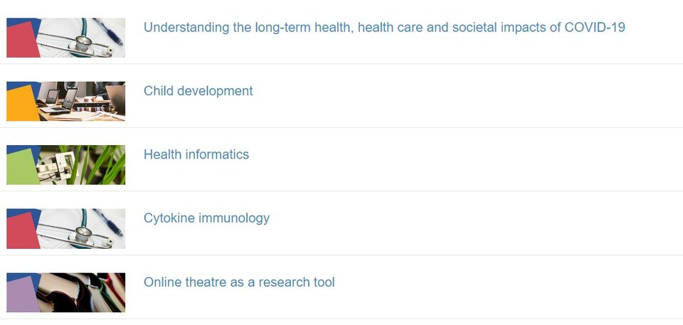
Those from outside the university might start looking at the University of Tartu research topics by selecting the option “Word in the description of the research direction” in the right-hand column of the dashboard. This option enables them to navigate using the most commonly used keywords, which the researchers have added to the descriptions (see Figure 1).
When looking for areas of research that provide research and development services, you can tick the respective box on the right-hand menu.
More visible networks
Explanations on how to use the dashboard are in the left-hand column. Using the list and the description enables one to move between research directions. When you click on the “Network charts” section, it is possible to visualise the research done at the University of Tartu as a whole or in a specific unit using four tabs.
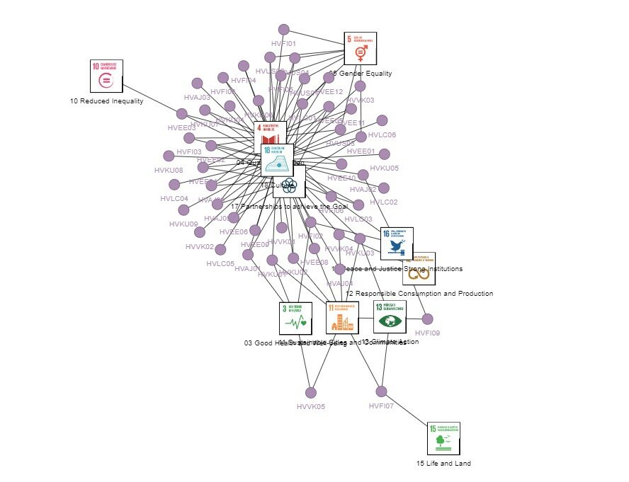
With the “Research directions and people” tab, filters can be used to visualise how the University of Tartu research areas are interconnected through the researchers (see Figure 2), i.e. to display the intra-university collaboration networks. In the figure, the research areas are marked by the colours of the University of Tartu faculties: purple for the research of the Faculty of Humanities and Arts, yellow for the Faculty of Social Sciences, red for the Faculty of Medicine, and green for the Faculty of Science and Technology.
If you look at the data for the entire university in one chart – the more colourful parts of the chart show closer collaboration between faculties. For example, one node may be in the digital humanities network, another in teacher education and still another in genomics and health information.

The diagram opening under the tab “UN Sustainable Development Goals and research directions” may seem cluttered at first. However, using the filters on the right, you can view which research directions are linked to which sustainable development goals. For example, if you filter by “UT faculty” and “Faculty of Arts and Humanities”, the chart shows that the displayed research directions are related to almost all of the UN Sustainable Development Goals (see Figure 3).
Clicking on the third tab, “Projects and research directions”, brings an overview of projects related to the research directions (see Figure 4). Each colour represents a different type of project: the dots for basic research are red, those for applied research are purple, and the dots for experimental development projects are blue. For example, information about the University of Tartu’s ongoing projects with a business potential can be found here.

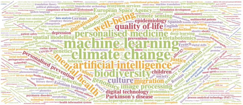
The fourth tab, “Keywords”, in the “Network charts” section uses a word cloud to visualise the keywords most closely associated with the work of the University of Tartu researchers (see Figure 5). The more a keyword has been used by different research directions, the larger it appears in the word cloud. We can see that the research areas of the University of Tartu are most frequently associated with the following keywords: climate change, machine learning, mental healthand artificial intelligence.
The research dashboard is the result of a collaboration between University of Tartu researchers, the Grand Office and the Rector’s Strategy Office. The information on the dashboard is updated quarterly.
Read more similar news


23.02.2024